


Who Doesn't Love a Good Map?
This Week We're Navigating Our Way Through Some Cartography Chaos.

WELCOME BACK!!! Good to see you all again.
This week I thought I’d do a theme, and that theme is MAPS, because who doesn’t love a good map?
So, in the interest of not losing your flimsy internet-addled attention, let’s get STRAIGHT INTO IT!
(In other news, now that we’re not on Instagram, feels a bit weird signing comics with “instachaaz”, so now it’s just good old ‘Hutton’ - which does feel a bit neater, and I’ll be honest, a bit classier)
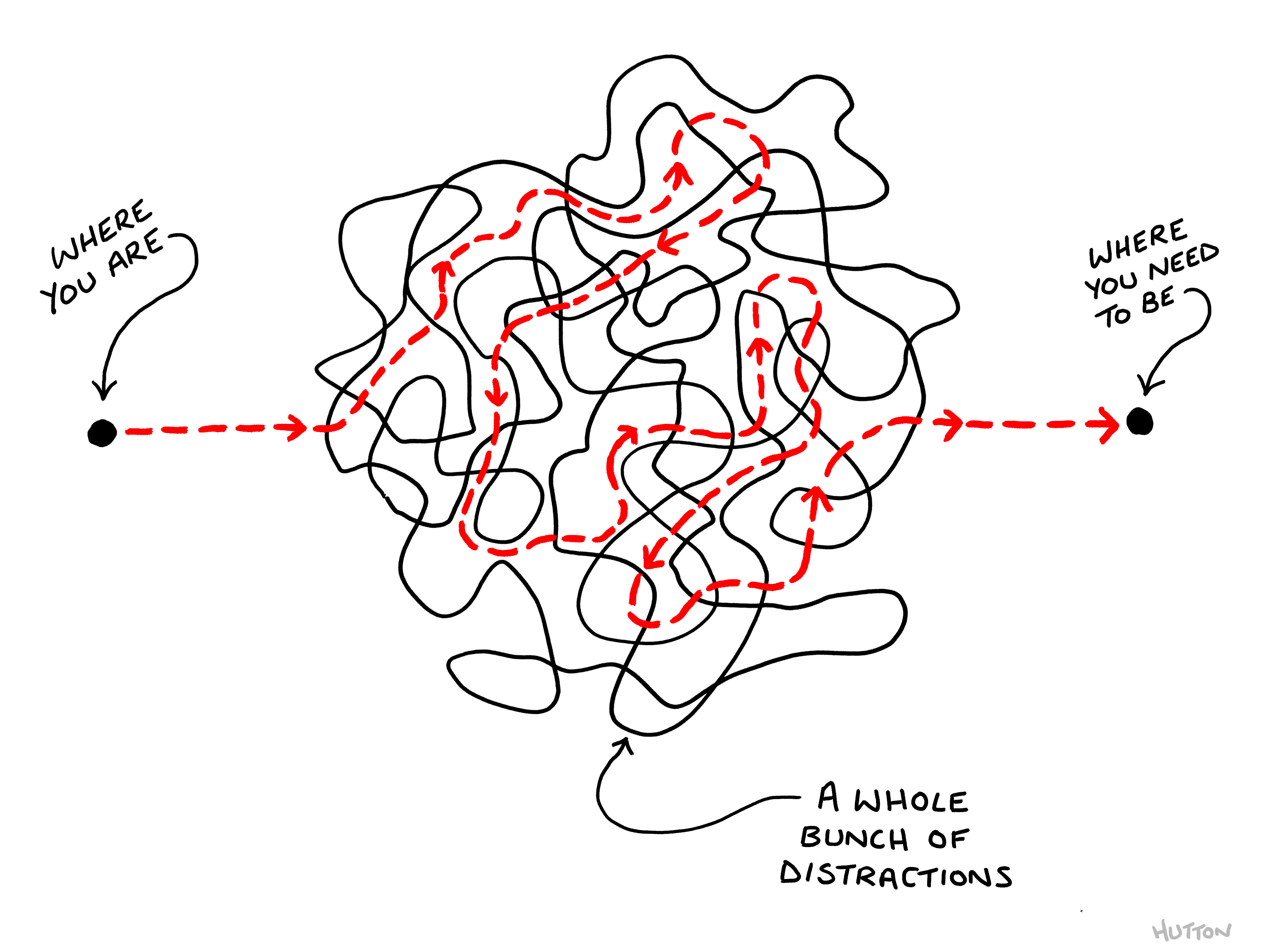
Anyway, moving on! Here’s a map of the process of getting this newsletter out each week.
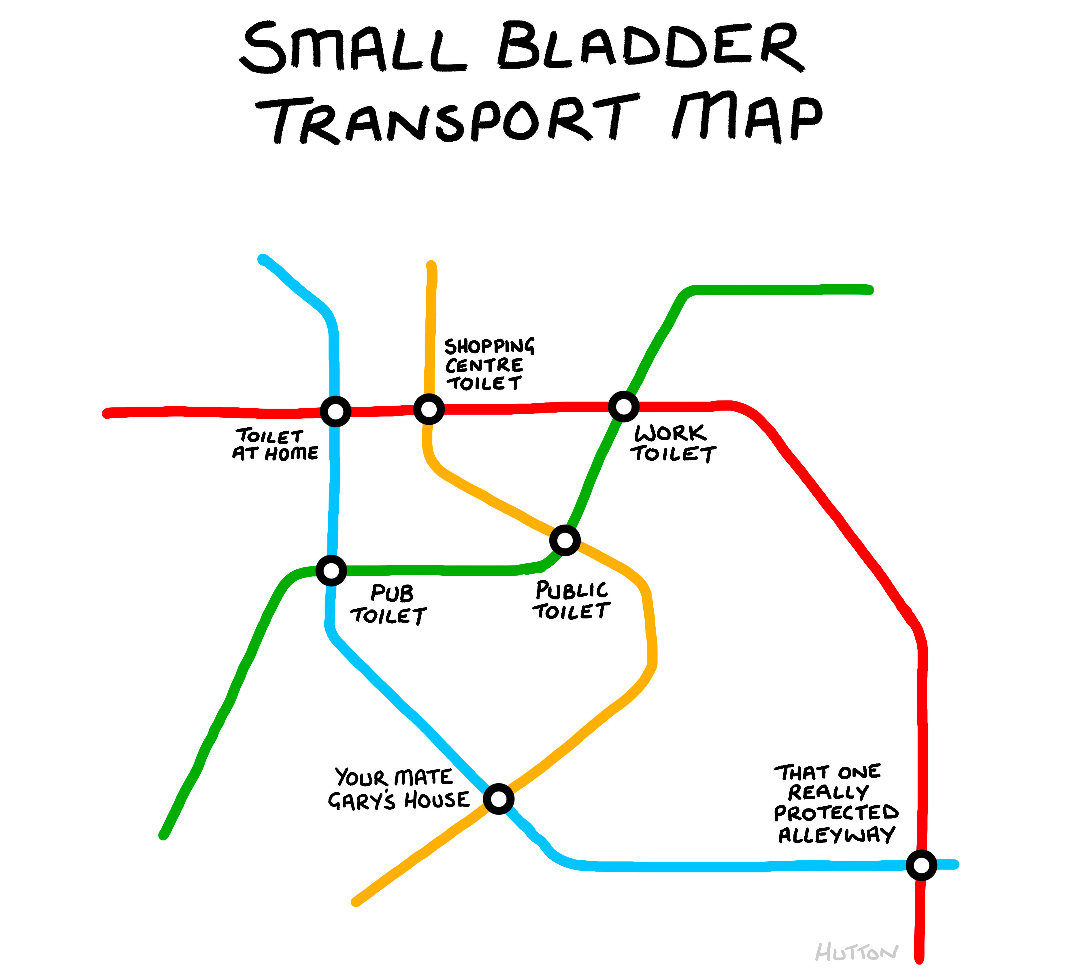
Next up I’ve revisited one of my old comics from (I can’t quite believe it, but) SEVEN years ago?! Having started drawing on sticky notes, and gradually ended up drawing on a tablet, it’s nice to be able to revisit some of the old sticky note comics and remix them a little…
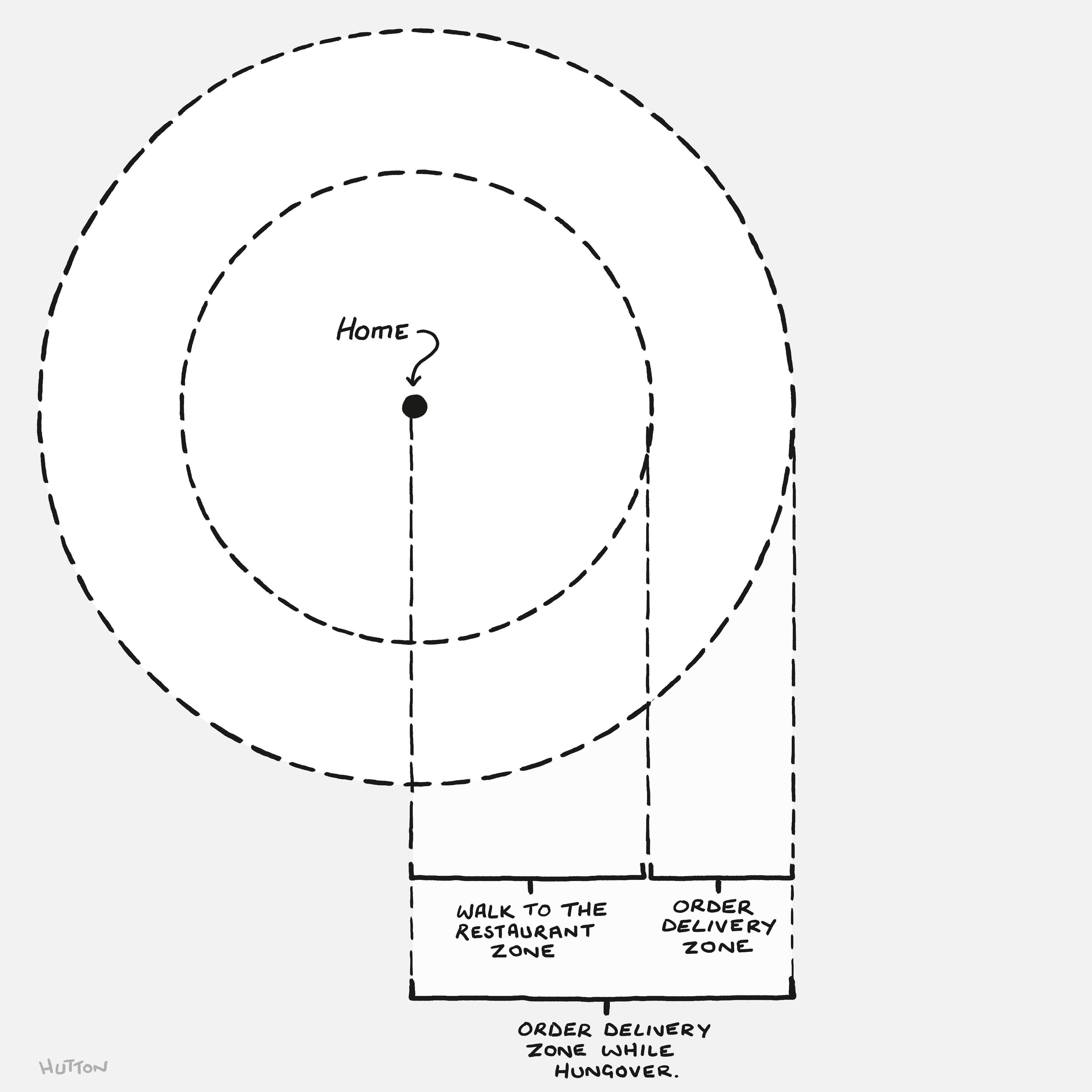
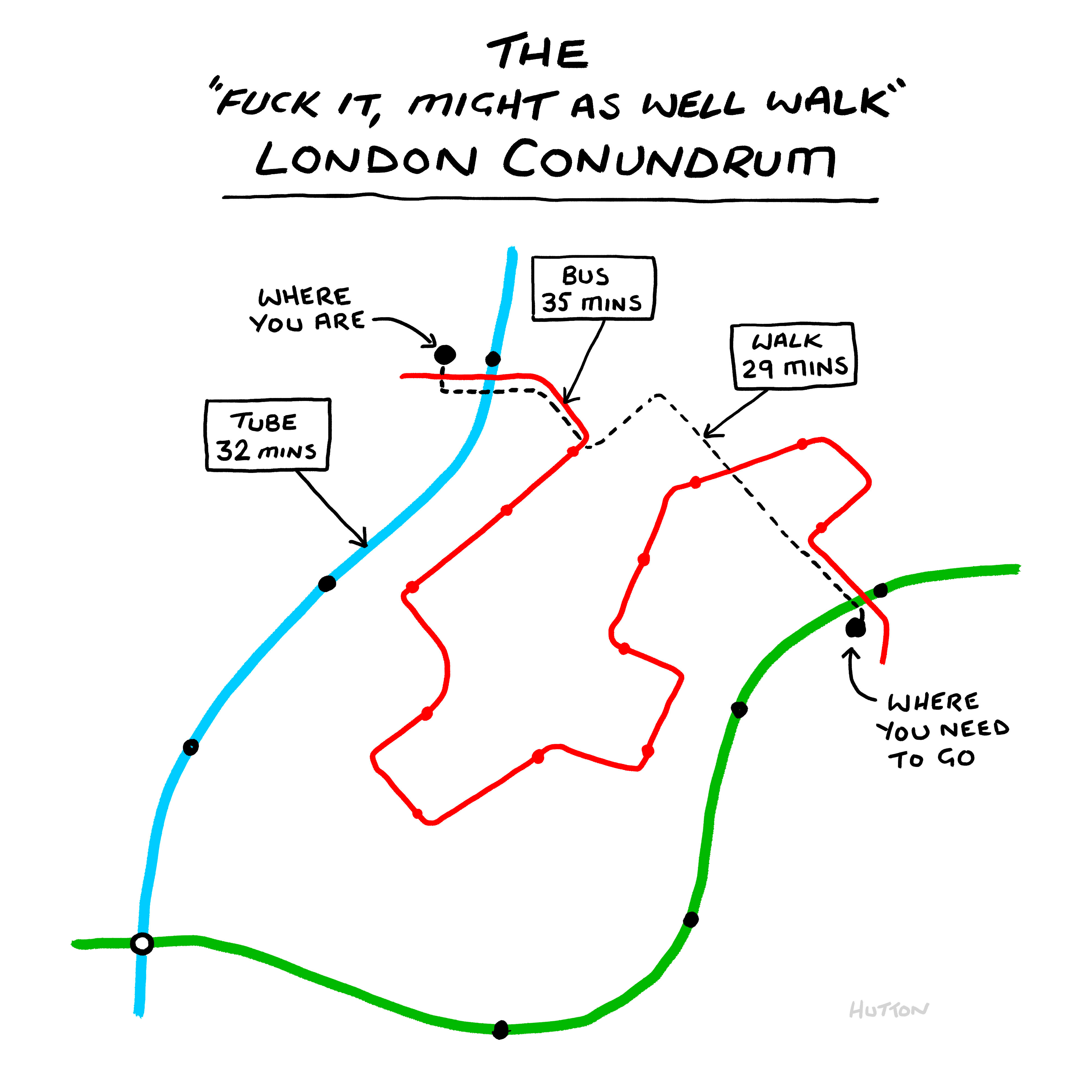
Speaking of things I can’t quite believe were seven years ago, recently I was in London and was reminded of my time there, and the reason I often ended up walking around a lot while I lived there.
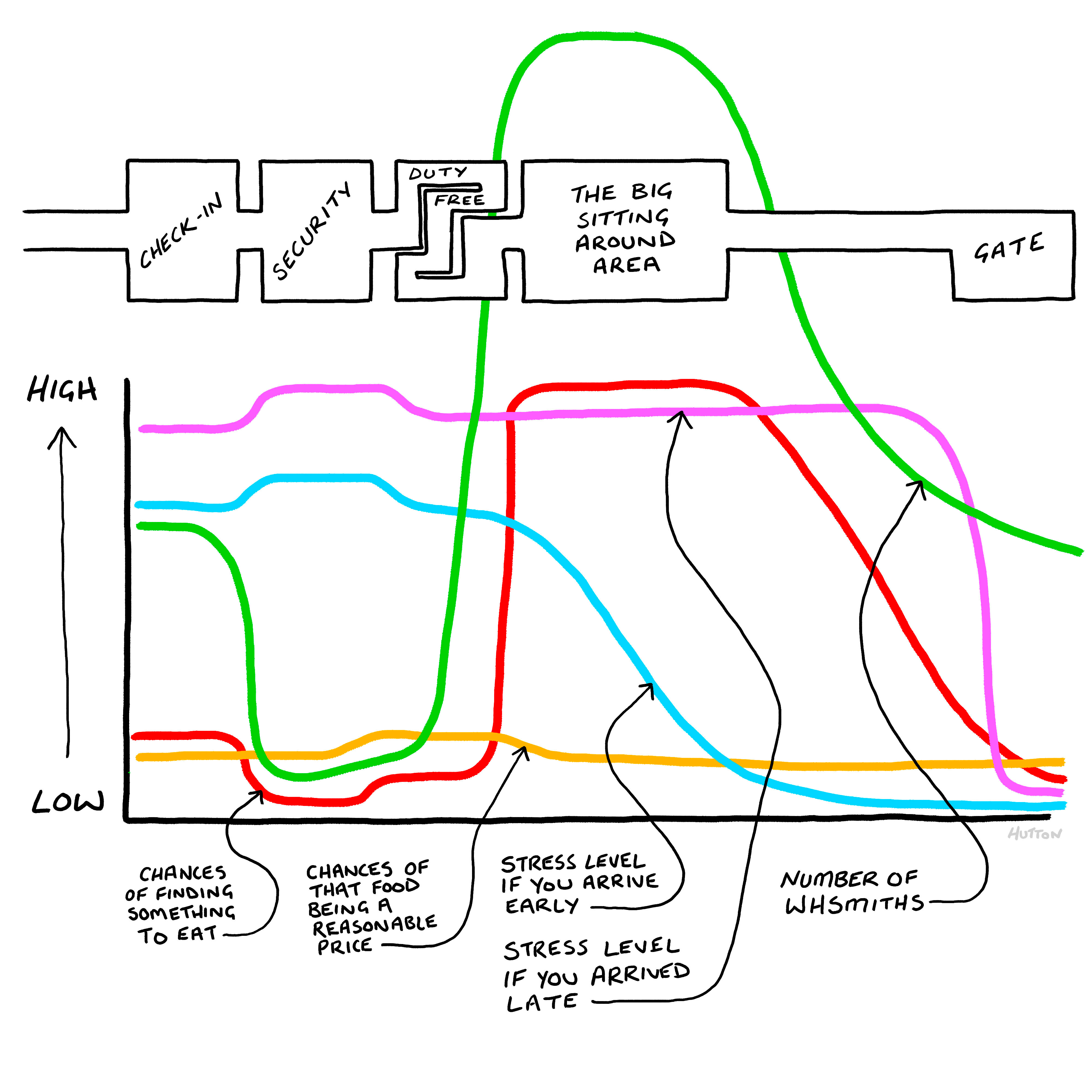
Now, I know we did airports last week, but clearly I wasn’t quite done and so I started drawing a map of an airport which then somehow became a graph as well. Look at me breaking all the rules and combining maps and graphs into some weird mutant comic! What a renegade.
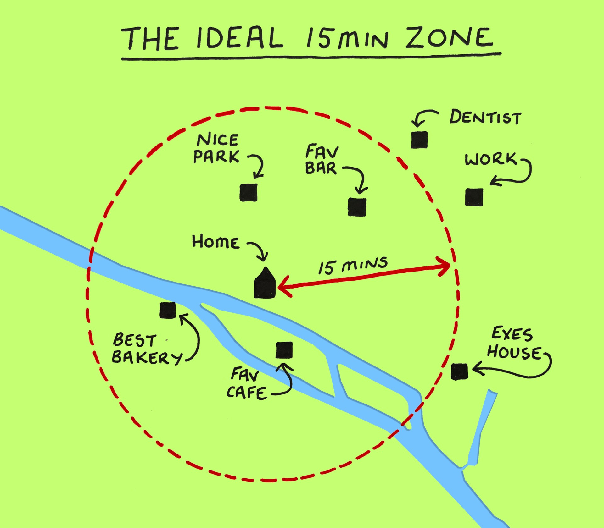
I’ve also been going through some of the back catalogue and here’s a little map I drew of the ideal ‘15 Minute City’ for an article on Atmos a few years back. There’s some more comics of mine in that article to be found there (including some hilariously derpy drawings of cars - enjoy that)
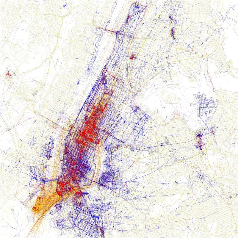
So this next map isn’t mine, but it’s really really great. Back in 2010 Artist Erica Fischer used data from Mapbox and Twitter (you know, when Twitter worked) to create a series of maps where red dots represent photos taken by tourists, and blue dots those taken by locals, neatly illustrating where the two groups predominantly hang out in each city. You can check out your own city here if you’d like to confirm your long held assumptions.
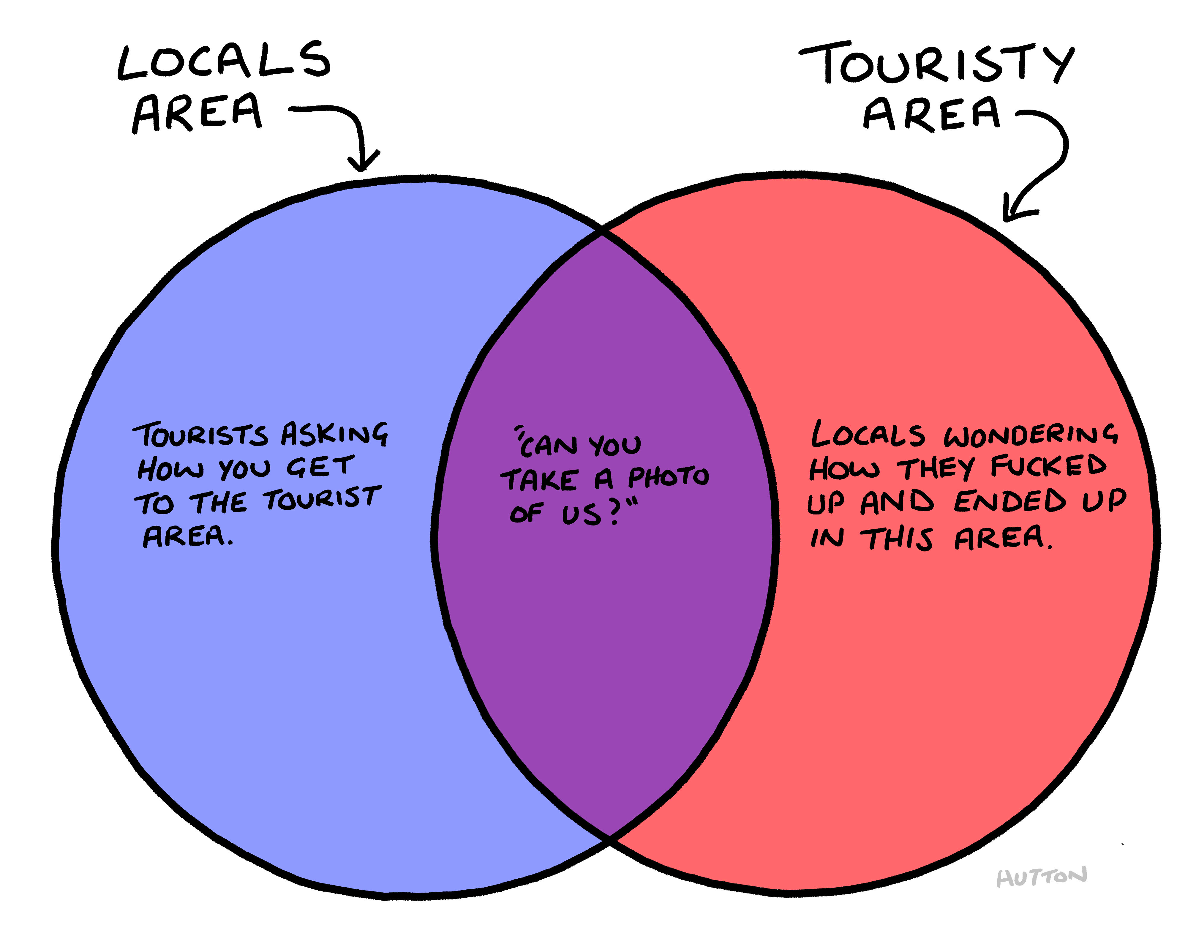
The reason I mention it was because I was inspired by Erica’s work and wanted to try and use the idea for a comic, with the tourist v local zones interacting in a map format. However, I should have known after all these years that when you’re trying to do a joke involving two zones that interact, you invariably just end up with a Venn:
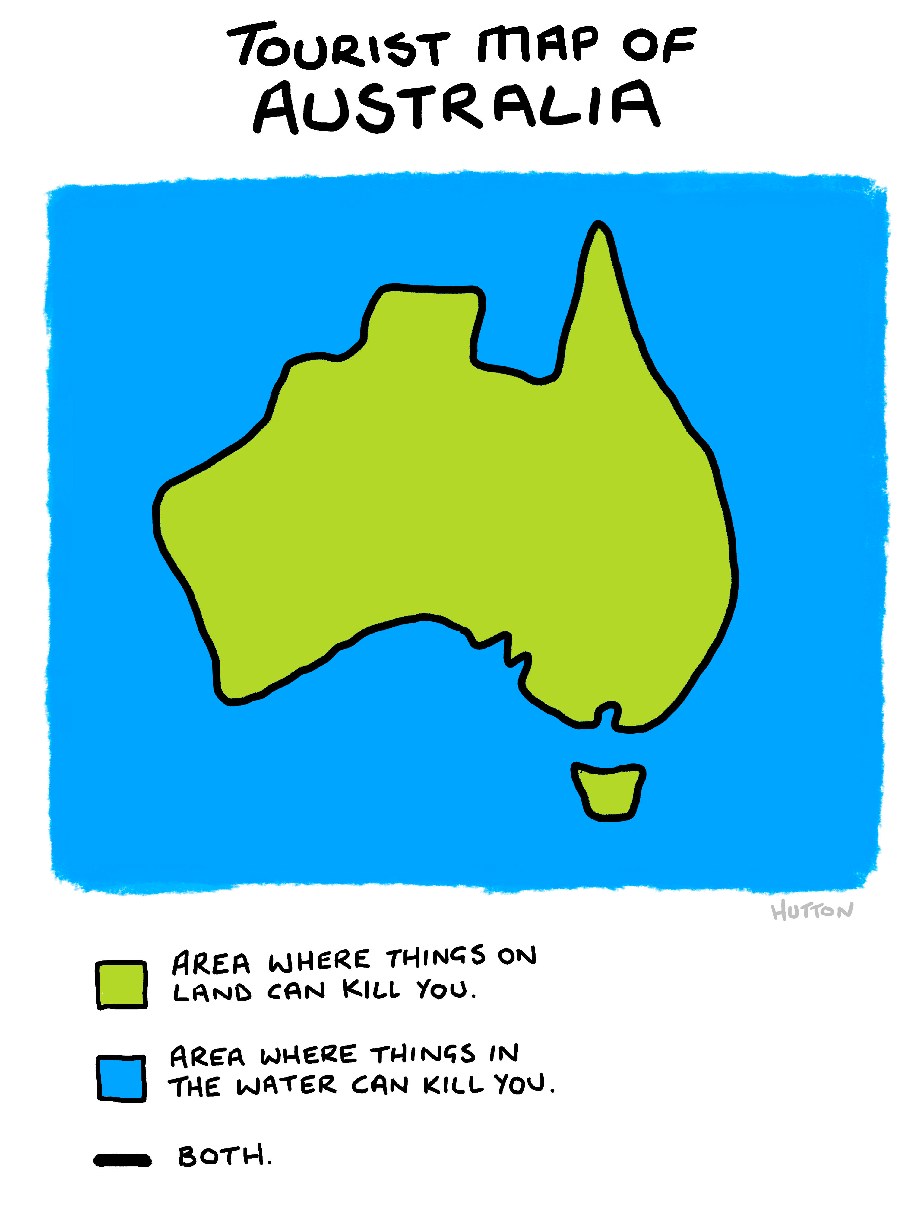
Speaking of tourists, here’s a handy little map of Australia for anyone thinking of visiting.
And, of course, to finish up… No Map Themed OUTLINED Edition would be complete without including the good old ‘Map of Every City’ - Still my best known work I think - I’m not sure what the Substack image file size situation is, so I’m really hoping you’ll be able to click on this image and zoom in and have a proper look at it!
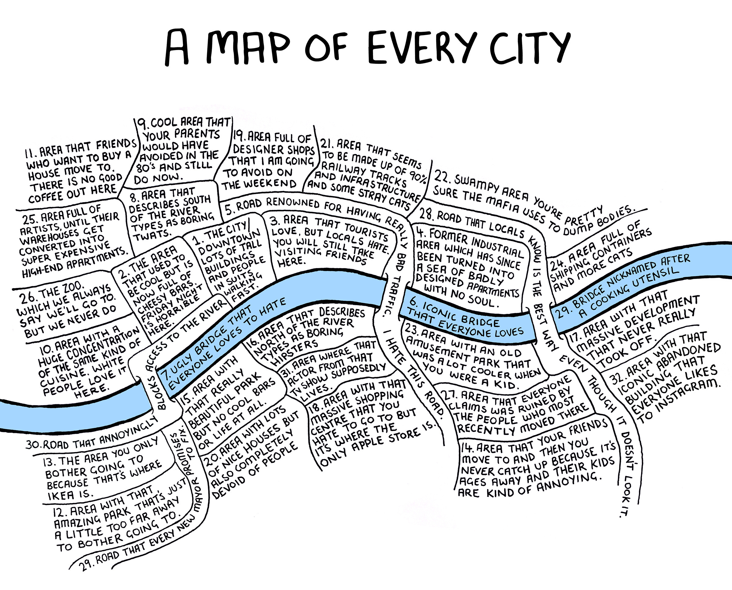
If you want to know a bit more about how this one came about, you can read all about that right here.
And THAT’S IT for another week!!! (I know, it’s always over so quickly)
If you’re not signed up to get OUTLINED in your inbox each Friday, you can do that right here: (it’s FREE to sign up, you just have to click the ‘Free’ option on the right when the page comes up)
Or, if you’re already subscribed and feel like becoming a paid subscriber in order to help the production of more nonsense every week and essentially becoming a patron to the arts (oooh, fancy), you should absolutely upgrade your subscription!
As always - Please do leave all your likes and comments - they’re ALWAYS appreciated and of course, the best thing you can do is share/forward this thing around! Thanks a million, and I’ll see you all next week.
Can confirm: that map of Australia is accurate.
Love that city map, Chaz!